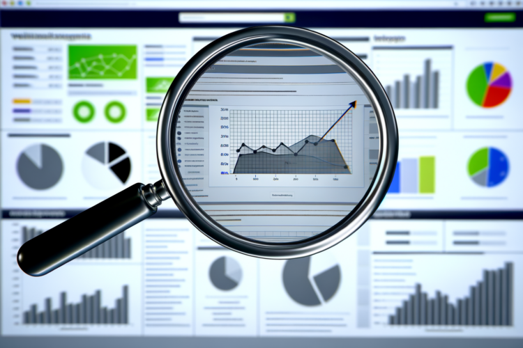
How to Create an SEO Dashboard: Step-by-Step Guide for 2025

Last Updated: December 5, 2025


  • Your SEO dashboard should be a live control center for traffic, rankings, revenue, and issues, not a pretty wall of charts you ignore after week two.
  • The best dashboards connect GA4, Search Console, rank trackers, and technical tools so you can see what content, topics, and channels actually drive money.
  • Modern SEO tracking has to cover AI Overviews, SERP features, Core Web Vitals, brand strength, and funnels, or you will miss half of what is happening.
  • If you keep the layout simple, tie every metric to a clear goal, and review it often, your dashboard turns from a report into a decision tool.

Your SEO dashboard should tell you, in a few minutes, if organic search is growing, which topics are working, and what is breaking, without you hunting across 10 tools.

Think of it as your daily SEO checkup: traffic, rankings, conversions, AI/SGE visibility, technical health, and brand signals in one place, so you can act instead of guess.

What an SEO Dashboard Really Does for You

An SEO dashboard is a single screen that pulls data from GA4, Search Console, your rank tracker, and other tools so you can see SEO performance at a glance.

You track traffic, see which pages and topics win, spot early drops, and tie everything back to actual conversions, not just vanity rankings.

Your dashboard is not there to impress people in a meeting; it is there to help you catch problems and double down on what works before your competitors do.

Before I started using proper dashboards, I would spend half a day each month rebuilding reports from scratch and still miss obvious trends.

Once I set up a clean dashboard with only the metrics that matter, I found issues in minutes that I used to overlook for weeks.

Isometric SEO control center dashboard unifying traffic, rankings, revenue, and technical signals.
Your SEO dashboard as a live control center.

What Your SEO Dashboard Should Show In 2026

If your dashboard does not help you answer real questions in under five minutes, it is not doing its job.

So start with the questions, then pick the metrics, not the other way around.

Core Metrics That Still Matter

You still need the basics, but measured the right way for GA4 and modern SERPs.

Here is a simple breakdown to keep in mind.

Question Metric Source
Is organic traffic growing? Organic sessions, users GA4
Are visitors engaged? Engagement rate, engaged sessions, avg engagement time GA4
Are we making money from SEO? Conversions and revenue from organic GA4
Which keywords and topics are driving this? Queries, average position, SERP features, AI/SGE appearance Search Console + rank tracker
Is our site healthy? Core Web Vitals, index coverage, errors Search Console + crawler

You can add more, but if these five questions are not easy to answer, you are starting in the wrong place.

Traffic without engagement, or rankings without conversions, is just noise.

Updated KPI List For Modern SEO

The old “bounce rate obsession” never helped much, and GA4 made that clear by shifting focus to engagement.

Your dashboard should reflect that change.

  • Organic sessions and users
  • Engaged sessions and engagement rate for organic landings
  • Average engagement time per session on key content
  • Organic conversions by type: leads, signups, purchases, demo requests
  • Revenue from organic search (where ecommerce or value tracking is in place)
  • Average position, impressions, and clicks for priority queries
  • Share of keywords with SERP features (featured snippets, People Also Ask, local pack, video, etc)
  • AI / Generative Experience impressions and clicks where reported
  • New vs lost referring domains and links
  • Core Web Vitals pass rate by device

If a metric cannot trigger a decision or a task, it probably does not belong on the main dashboard view.

I sometimes keep a second dashboard tab for “nice to know” metrics, but the home tab stays ruthless and short.

That way it stays useful instead of turning into a museum of charts.

What Tools You Actually Need

You do not need every tool on the market, but you do need a clean stack that can talk to your dashboard builder.

Here is a simple setup that works for most teams.

Purpose Tool Examples How it feeds your dashboard
Analytics & conversions GA4 Native Looker Studio connector or BigQuery
Queries, impressions, AI appearance Google Search Console Native connector, export, or BigQuery
Rankings & SERP features Ahrefs, Semrush, STAT, AccuRanker Partner connector or Google Sheets / CSV
Backlinks & authority Ahrefs, Semrush, Majestic Partner connector, API to Sheets, or CSV
Technical & CWV Search Console, PageSpeed API, Screaming Frog, Sitebulb GSC connector, custom connectors, or sheet exports
Local presence Google Business Profile tools Third‑party connectors

I like Looker Studio because it is free and has solid native connectors, but for big sites I often route data through BigQuery or Sheets to avoid quota and sampling problems.

Some teams jump straight into Tableau or Power BI, which is fine, but often overkill if your site is under a few hundred thousand visits a month.

GA4 Events, Conversions, And Dimensions You Should Set Up

GA4 only becomes helpful for SEO once you define events that match your funnel and content.

If you skip this, your dashboard will feel thin and vague.

  • Core conversion events: purchase, generate_lead, sign_up, subscribe, contact_form_submit
  • Content engagement events: scroll (90 percent), video_start, video_complete, view_item, file_download
  • Custom dimensions: content_group (topic or hub), page_type (blog, product, category, support), author where relevant

Then in your dashboard, you can split conversions by channel and landing page topic instead of staring at one global conversion number that hides everything.

For SEO vs non‑SEO comparison, filter on “session default channel group” equal to “Organic Search” or build landing page rules with regex in Looker Studio.

Set up your GA4 events once, properly, and every dashboard you build after that becomes 10 times more useful.

If you run into GA4 thresholding or cardinality issues, aggregate by content group instead of full URL and push raw data to BigQuery for heavier analysis.

I resisted that for a while, but on large sites it is the only way to keep dashboards stable.

Bar chart comparing modern SEO KPIs including traffic, engagement, revenue, AI and technical health.
Focus your dashboard on decision‑driving SEO metrics.

Connecting Your Data And Picking A Dashboard Builder

Your dashboard is only as trustworthy as the data pipeline behind it.

Sloppy connectors and half‑configured properties will break things more than any design mistake.

How To Connect Your Core Sources

You do not need anything fancy to start; you just need each tool flowing consistently into Looker Studio or your chosen builder.

I like to think in layers.

  • Source layer: GA4, Search Console, rank tracker, backlink tool, CWV data
  • Staging layer: BigQuery or Google Sheets for cleaning, joining, and aggregating
  • Dashboard layer: Looker Studio or another BI tool

For small sites, you can skip the staging layer and connect GA4 and GSC directly into Looker Studio.

But once you add more tools and more traffic, Sheets or BigQuery becomes useful to keep things faster and cleaner.

Native vs Partner Connectors

This is where a lot of people get confused, so let me keep it simple.

Here is how I usually choose.

Type Use When Watch Out For
Native connectors (GA4, GSC) You want quick setup for traffic and query data Sampling, thresholding, slower dashboards for long date ranges
Partner connectors (Ahrefs, Semrush, STAT) You need rankings, backlinks, SERP features, SGE flags Extra cost, connector limits, data freshness
Google Sheets / CSV You want control, custom joins, or have no connector Manual exports unless automated, sheet size limits
BigQuery You have large sites, complex queries, or heavy history Requires some SQL, extra setup effort

I usually start with native GA4 and GSC connectors, then add Sheets or BigQuery when performance or sampling becomes a problem.

Trying to glue five partner connectors together before you need them is how dashboards become fragile.

Choosing A Dashboard Builder

For most SEO teams, Looker Studio is enough, especially when you are still figuring out what you want your standard report to look like.

Still, not every tool fits every team.

Tool Best fit Drawbacks
Google Looker Studio Small to mid sites, agencies that live in Google stack Can get slow with big date ranges and complex blends
Tableau Large companies, lots of non‑Google data Paid, steeper learning curve
Power BI Teams deep in Microsoft tools Less friendly for typical SEO stacks

If you are not sure, start in Looker Studio and only switch when you outgrow it.

Switching too early usually wastes time, not saves it.

Building A Stable Layout That People Actually Use

A good dashboard layout feels boring in a good way: you know where to look every time.

I like a simple, top‑to‑bottom flow.

  • Row 1: Key scorecards (organic sessions, engagement rate, conversions, revenue)
  • Row 2: Traffic and conversion trends (line charts, 30-90 days)
  • Row 3: Query and page tables with filters
  • Row 4: Technical and Core Web Vitals panel
  • Row 5: Brand and authority metrics

You can split this across tabs if needed: Overview, Content & Keywords, Technical, Links & Brand, Local/International.

But do not try to cram 12 charts into the top fold; you will only overwhelm people.

When someone sees your dashboard for the first time, they should instinctively know where the story starts and where it goes next.

A simple trick I use is to label each section with a short question: “Is organic growing?” “Which topics are working?” “What is broken technically?”

This nudges everyone to read the dashboard as a story instead of random graphs.

Role‑Based Tabs For Different Teams

A CEO does not want to stare at crawl error types, and your developer does not need a detailed breakdown of branded vs non‑branded conversions every week.

Trying to serve everyone with one cluttered page is a mistake.

  • Exec tab: 3-5 KPIs, trend lines for organic revenue and leads, high‑level traffic and brand search volume
  • SEO & content tab: queries, topics, content performance, SERP features, AI visibility, content opportunities
  • Technical tab: CWV, indexation, crawl errors, 4xx/5xx trends, JavaScript or render issues
  • Local / international tab: country breakdowns, local rankings, Google Business Profile performance

This separation sounds like more work at first, but it actually reduces back‑and‑forth questions later.

And you can usually build these as variations of one shared template, not from scratch each time.

Flowchart of SEO data sources feeding staging layer and dashboard tools.
From raw SEO data to reliable dashboards.

Designing The Core SEO Dashboard Layout

Once your data is connecting cleanly, the layout is where you win or lose adoption.

Think of the main view as your “morning coffee” screen.

Section 1: SEO Overview Panel

This is where you answer the basic “are we doing better than last period” question.

Keep it tight.

  • Scorecards: organic users, organic sessions, engagement rate, organic conversions, organic revenue
  • Line chart: organic sessions and conversions over the last 30 or 90 days
  • Bar chart: organic conversions by landing page type or content group

Compare the current period to the previous one with percent change indicators, but do not obsess over tiny swings.

I like to annotate major events like site migrations or big algorithm changes, even if it is just a text box with dates.

Section 2: Keyword, Topic, And SERP Performance

Plain keyword rankings are not enough anymore; you need SERP context and topic groupings.

This is where your rank tracker and Search Console data really pay off.

  • Table 1: GSC queries with impressions, clicks, CTR, avg position, AI / SGE appearance, search intent tag
  • Table 2: Rank tracker data with current rank, device, SERP features owned (snippet, PAA, local, video), search volume
  • Chart: share of tracked keywords with at least one SERP feature present, by week or month

If your tool supports it, add columns for “featured snippet?” or “PAA?” as simple yes/no flags; this looks basic but is very practical.

You can then filter which queries lost a snippet in the last 30 days and treat those as priority fixes.

Instead of bragging about “rank 1,” start asking how much SERP real estate you own for the terms that actually bring revenue.

To bring topics into this, use a content_group or a Looker Studio CASE formula on URLs so you can see query performance per topic or hub.

For example, one topic for “pricing,” another for “how‑to guides,” another for “product X,” and so on.

Section 3: Content & Topic Performance

Pages do not live alone; search engines look at topical depth, so your dashboard needs a content view that goes beyond URLs.

I like a two‑level approach.

  • Topic table: topic name, organic sessions, engagement rate, conversions, revenue, avg position of queries in that topic
  • Page table: URL, page title, topic, organic sessions, engaged sessions, engagement rate, conversions, last updated date

This makes it easier to justify investments: you can show that your “email marketing” cluster has grown by 40 percent in traffic and 25 percent in conversions, not just that one blog post did well.

If you want to get more tactical, add a “content opportunities” block.

  • Pages with high impressions but low CTR (need better titles, descriptions, or SERP features)
  • Pages with strong traffic but low conversion rate (need better offers, CTAs, or alignment with intent)
  • Pages losing traffic or impressions over 3-6 months (might need content refresh or technical checks)

You can build these as filtered tables using conditions on CTR, conversion rate, and change over time.

Once those exist, your content team will stop asking “what should we work on next” because the list is right there.

Section 4: Technical SEO & Core Web Vitals Panel

Technical health can get complex fast, so your dashboard should summarize, not overwhelm.

Still, it needs more than one “site speed” scorecard.

  • Core Web Vitals summary: number of good, needs improvement, and poor URLs by LCP, INP, and CLS, split by device
  • Trend chart: percentage of good URLs over time
  • Index coverage: indexed vs non‑indexed pages, and a table of top indexation issues
  • Error breakdown: top 4xx and 5xx error types with count of affected URLs

You can pull CWV from GSC CWV reports via connectors or by using CrUX / PageSpeed Insights APIs into Sheets or BigQuery.

For crawl errors, export from Screaming Frog or Sitebulb, then bring that into Looker Studio as a separate data source.

Technical dashboards should answer one thing clearly: where are users and crawlers failing most often, and is that getting better or worse?

I am not a fan of dumping full crawl data into dashboards; those are better left inside the crawler tools themselves.

Use the dashboard as a summary and an alert, not as a duplicate of every crawl report.

Section 5: Brand, Authority, And E‑E‑A‑T Signals

You cannot directly graph “E‑E‑A‑T” from any Google API, but you can track some strong proxies.

This is where brand strength starts to show up in numbers.

  • Branded query table: impressions, clicks, CTR, avg position for brand and brand + product searches
  • Trend chart: branded vs non‑branded organic sessions and conversions
  • Link panel: total referring domains, new vs lost domains this period, topical relevance where available
  • Unlinked brand mention count from tools that track mentions across the web (where available)

When branded search grows while non‑branded stays flat, it tells a different story than raw traffic numbers alone.

I also like to maintain a list of “authority‑building” content, such as in‑depth guides or research posts, and show their traffic, links, and mentions separately.

Infographic outlining five key sections of an effective SEO dashboard layout.
The five pillars of a usable SEO dashboard.

Tracking AI Overviews, Funnels, Local, And Global SEO

A modern SEO dashboard has to deal with AI Overviews, user journeys, and regional performance, or it will give you a partial view at best.

This is where a lot of setups are weak, even inside big teams.

Tracking Performance In AI Overviews / Generative Search

AI Overviews and similar generative search features change how users click, and your dashboard needs to surface that shift.

You will not get a perfect view, but you can get close enough to act.

  • Use Search Console “search appearance” filters for any AI or “Generative Experience” entries where available
  • Build charts showing impressions and clicks from those appearances vs standard web results
  • Create tables of top queries that trigger AI Overviews and track CTR changes
  • Tag topics that are heavily impacted by AI answers and compare their organic CTR to less affected topics

Some rank trackers also flag when a SERP has an AI box or similar generative result; pull that column into your keyword table so you can see which terms are at risk of zero‑click patterns.

Is this perfect visibility? No, but it is far better than pretending AI Overviews are just a news headline and not a reporting problem.

Funnel And Journey Views For SEO

Organic traffic without a journey view is hard to defend in front of sales and product teams.

They want to see how SEO visitors move through the site, not just that they arrived.

  • Build GA4 funnels that start with organic landing sessions and move through key steps: view product, add_to_cart, start_checkout, purchase
  • Create separate funnels for content types: blog first‑touch funnels vs product page first‑touch funnels
  • Show drop‑off rates at each step for organic vs paid or direct
  • Include an assisted conversion chart if you use GA4 attribution, so organic can get some credit for top‑of‑funnel work

In Looker Studio, you can mirror these funnels with bar charts or step visuals, but I still rely on GA4 Explorations for deeper ad‑hoc analysis when needed.

The dashboard just needs a clear snapshot, not every possible funnel slice.

Once stakeholders see that SEO drives both first‑touch and assisted conversions along the funnel, the “SEO only brings top‑of‑funnel traffic” argument fades very quickly.

If you track micro‑conversions like scroll depth, video views, or downloads, show a simple bar chart of those events by landing page type so you can flag content that engages but does not yet convert.

Then conversion rate optimization work has a clean starting point.

Local SEO Module

If you have physical locations, your dashboard without local data is missing a big piece of reality.

You need a small local panel, even if it is on a separate tab.

  • Google Business Profile views, calls, and direction requests per location via third‑party connectors
  • Local pack rankings for key terms, grouped by city or region
  • Review count and average rating, plus trend over time
  • Organic traffic and conversions to location pages

When you see a location with flat organic traffic, falling reviews, and weaker local pack visibility, you know it is more than an SEO issue; it becomes a local marketing and operations conversation.

That is when dashboards really start driving real‑world changes, not just meta tags.

International SEO Module

For international sites, one blended global dashboard hides as much as it reveals.

Break things down once, then reuse the pattern.

  • Country and language breakdown: sessions, conversions, revenue per country and locale in GA4
  • Search Console performance segmented by country and language property where used
  • Hreflang coverage: errors and missing tags from your crawler exports, summarized in a small table
  • Separate dashboard tabs per region or major language with local top queries and pages

I have seen teams chase “SEO drops” that were actually just one country losing visibility while others grew; you only see that nuance when you break data out by region.

This also helps local content teams own their numbers without digging through irrelevant countries.

Monitoring Cadence And Alerts

Your dashboard does not replace alerting; it supports it.

You still need some basic monitoring habits.

  • Daily: glance at main scorecards for big traffic or conversion swings, and check any uptime or 5xx alerts
  • Weekly: review query and page trends, AI/SGE appearance changes, technical summary, and top content opportunities
  • Monthly: step back to look at topics, funnels, brand growth, and long‑term CWV and indexation trends

GA4 and Search Console can send email alerts for sudden traffic drops or large error spikes; use those, then use the dashboard to diagnose.

Looker Studio itself is more of a visualization layer than an alerting system, and expecting it to warn you about everything is not realistic.

The real value of a dashboard shows up when you pair it with a simple review routine; without that, it is just a nice chart you stare at once a quarter.

Build a short checklist for each review cadence and keep it in a text box off to the side of the dashboard if you have to.

It may feel unnecessary, but it keeps everyone aligned on how the data should be used, not just viewed.

Checklist infographic covering AI, funnels, local, international SEO and monitoring cadence.
Essential checks for a complete SEO dashboard.

Filters, Templates, And Agency Workflows

Once the core is in place, filters and templating turn a good dashboard into something your whole team can actually live in.

This is where a lot of time savings show up.

Smart Filters And Segmentation

Without filters, your dashboard will turn into a static PDF; useful once, then outdated.

You want interactive controls that match the way you think about your site.

  • Date range controls with presets: last 7, 28, 90 days, and previous period comparison
  • Device filter: desktop, mobile, tablet, so you can see when mobile is slipping
  • Channel filter: organic vs all traffic, to keep SEO views clean
  • Landing page or topic filter: pick a specific content hub or product line
  • Brand vs non‑brand filter: based on query regex or custom field from your sheets

A simple brand vs non‑brand toggle has saved me more arguments about “SEO performance” than most other tricks.

Often brand traffic hides problems in discovery traffic, and you only see that once you split them.

Building And Sharing Templates, Especially For Agencies

If you manage multiple sites or clients, building each dashboard from scratch is a bad use of time.

You want one solid template that can be parameterized per property.

  • Create a master Looker Studio template with data sources left as parameters
  • Use filters for domain or property so you can swap in new sites without rewriting charts
  • Add a text area for “Monthly notes” where account managers can summarize context, wins, and next steps
  • Link out to a shared document or slide deck for deeper commentary when needed

Client dashboards should focus more on outcomes than geeky inputs: leads, revenue, bookings, and the content and topics that drove those.

The technical and SERP detail can sit on another tab for your team.

Example Widget‑By‑Widget Starter Layout

If you feel stuck on how to assemble everything into one coherent view, here is a simple one‑page starter blueprint.

You can adapt it, but do not overcomplicate it on day one.

  • Row 1
    • Scorecards: organic users, organic sessions, engagement rate, organic conversions, organic revenue
    • Date and device controls on the right
  • Row 2
    • Line chart: organic sessions vs organic conversions
    • Bar chart: conversions by content group
  • Row 3
    • Table: GSC queries with impressions, clicks, CTR, avg position, search appearance (web, AI, rich result)
    • Filter: brand vs non‑brand
  • Row 4
    • Table: top landing pages with topic, sessions, engaged sessions, engagement rate, conversions
    • Filter: topic
  • Row 5
    • Panel: Core Web Vitals summary (good/needs work/poor) and indexed vs non‑indexed pages
    • Panel: referring domains trend and new vs lost domains table

This is not fancy, but it covers traffic, behavior, content, SERPs, technicals, and authority in a single pass.

Once your team is comfortable with it, you can add AI/SGE‑specific tabs, local tabs, and deeper funnels.

You do not need a complex dashboard to be effective; you need a clear one that you actually look at every week and adjust as your site and search change.

When something big shifts in search, update your dashboard: add new search appearance filters, new events, or new panels instead of keeping an old layout alive out of habit.

If you treat your dashboard as a living part of your SEO process rather than a one‑off project, it becomes one of the most helpful tools you use, not just another report sitting in a folder.

Need a quick summary of this article? Choose your favorite AI tool below:

Leave a Reply

Your email address will not be published. Required fields are marked *

secondary-logo
The most affordable SEO Solutions and SEO Packages since 2009.

Newsletter